-

Mick
(Site Admin)
75ZT Community
A social community of enthusiasts, owners, appreciators and collectors. With expert knowledge of all things from MG to Rover and beyond.
Introducing new features by SpongeBob (Page 2 of 3)
- Related topics: (no related topics)
Sure. Start a new thread in the website feedback forum and set up a poll. Won't make any difference but you're welcome. 
Nice new design. I sorted the characters size by using the zoom feature of my browser (Firefox), meaning pressing "Ctrl" and the mouse roller for larger or smaller characters. Firefox 12 keeps the Zoom setting for this site in memory without changing the zoom levels of other sites (each site zoom level can be set separately)
Majed
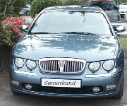
I miss you a lot Samarkand!

I miss you a lot Samarkand!
personally i like the new design its more appealing on the eye in my opinion
Robs Pictures at :
Robs Car Gallery
click below to access nano website

Planning is an unnatural process, much better to just get on with things, that way failure comes as a complete surprise instead of being preceeded by a period of worry and doubt
Robs Car Gallery
click below to access nano website

Planning is an unnatural process, much better to just get on with things, that way failure comes as a complete surprise instead of being preceeded by a period of worry and doubt
Must have a look when I next log on at the PC!
-

Mick
(Site Admin)
I've picked a random post and done a comparison screenshot. 2011 left, new version right.
You do not have the required permissions to view the files attached to this post.
The problem I see with the new larger format as above is that we would not know if the Mid Lancs Meet was in January, June or July? 
"Keep Smilin'"
Andy
Andy
-

Mick
(Site Admin)
zojosc wrote:The problem I see with the new larger format as above is that we would not know if the Mid Lancs Meet was in January, June or July?
And there was me opening a poll at your request.
-

Jürgen
(Site Admin)
SpongeBob wrote:I chose the larger sizes of text (only generally a small percent larger) to make it easier to read larger portions of text. On average, I don't think the text being used in the new design is any larger than that of any other respectable website.
I like it that way. I used to increase the size of the text with Safari, just one step. Now it's convenient at default.

BTW, good work, Simon.
-

Jürgen
(Site Admin)
Found a typo. 


You do not have the required permissions to view the files attached to this post.
-

Mick
(Site Admin)
Trust you. 
-

Jürgen
(Site Admin)
-

Mick
(Site Admin)
persuer wrote:The only thing I did like on the old format is that I could see what were the latest posts in all the forums.
Little green star top right of the icon.
-

Jürgen
(Site Admin)
I need to express some serious criticism here.
It has to be said, as it's quite important.
So let get me started ...
Well, one more thing, it's about positive criticism. Therefore, joking apart.
Simon, you did (and you are still doing it) a terrific job behind the scenes. I know what can be involved in such projects, as I'm working in the IT business myself.
Just one final word:

-

Jürgen
(Site Admin)
Is the difference intentional? 
You do not have the required permissions to view the files attached to this post.
-

SpongeBob
If you mean the newly styled hover-over tips then yes  Something a bit nicer than your average yellow tooltip
-

Mick
(Site Admin)
He means new messages hover-over is in the old yellow style.
-

SpongeBob
Mick wrote:He means new messages hover-over is in the old yellow style.
In that case, no. They should appear all the same. One to add to the bugs list
-

Jürgen
(Site Admin)
SpongeBob wrote:Mick wrote:He means new messages hover-over is in the old yellow style.
In that case, no. They should appear all the same. One to add to the bugs list
Yep, both screen shots were related to the new style.
-

Mick
(Site Admin)
And have been fixed. 

